 ://argon.red
些许字体排印 & Typography Stuffs
在看不见的地方做一些看不见的工作,这样别人就会觉得我在摸鱼了。Feeling great to fuck around with invisible details!
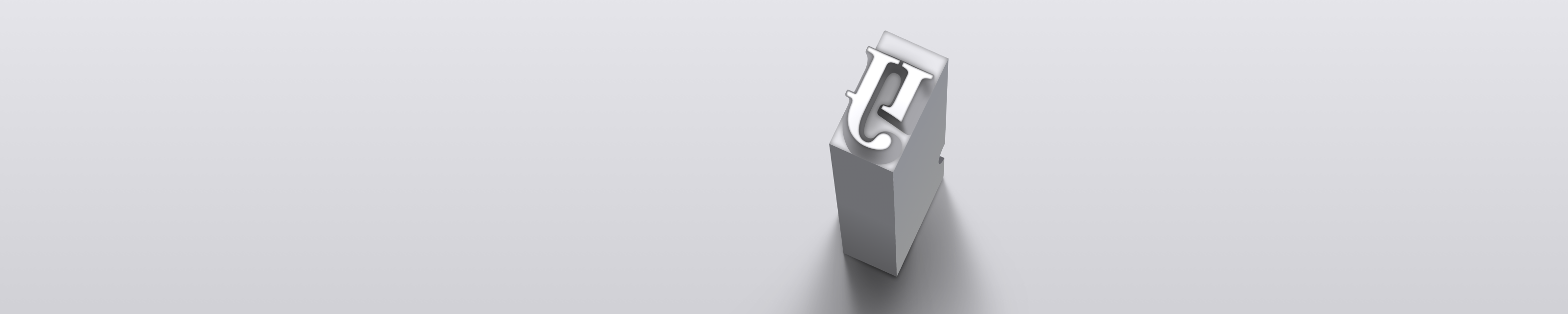
Long S
The long s was a historical form of the letter s, which was no longer used in English since the late 18th century. This section is typeset using long s’s, and could be hard to read for modern readers.
I had AI recognize the above image; none of them worked well. Google Gemini was particularly stubborn on insisting that the ſ and the f were exactly the same.
Antimony, the sans-serif font used on this website, has an OpenType feature cv021 that enables automatic substitution for the long s. The rules are quite simple:
- Replace a round s with a long s if not the last letter of a word.
- Replace it back if an f is adjacent.
Some earlier typographers forbade using long s before b or k, i.e. letters other than ℓ that have a full ascender. Antimony doesn’t follow that.
For consecutive s’s, Antimony doesn’t apply special rules either. But I had fun creating ligatures for s’s in another font of mine: two s’s become a ß2, and three s’s become a weird-shaped glyph — I called it evil.

Many sans-serif fonts don’t attach a partial bar to the left of ß, but to the long s. No native user of the long s is alive today and I asked AI about the inconsistency; they didn’t give a shit.
标点策略
W3C 很久之前提出了《日文排版需求》《中文排版需求》,Chrome 在去年初终于实现了 CSS 属性 text-spacing-trim3。此属性依赖 OpenType feature halt 或 vhal 来界定标点字形的边界。
Firefox 和 Safari4在目前都没有支持。作为有素养的 typographer,以及为了自动解决有歧义的中西文共用标点,本站的标点策略以额外的脚本来实现。
标点挤压
按照减法规则理解,全宽式5标点挤压要求:
- 对于连续的开标点或闭标点序列,删去每对之间的半宽空。
- 对于相邻的闭-开标点,删去之间的半宽空。
- 删去在行首的开标点前(及行尾的闭标点后)的半宽空。
两侧空的标点(间隔号、短连接号)在此不作讨论。Chrome 的 text-spacing-trim 默认值启用了前两项。如果只实现这两项很简单:
- 最轻松的方法,使用自定义的标点字体,为标点对作 kerning6。
- 或者给必要的标点裹上
span,设置letter-spacing: -0.5em。
要实现第三点就非常麻烦了,没有 API 能检测元素在视觉行中的位置。不过这里有个 hack:排版引擎会合并连续的空格符(取第一个的样式),并忽略块级元素每行开头和结束的空格符。本站(及 Han.css)使用了此特性。
将全宽标点替换为半宽标点+半宽空格的组合,在连续的开标点或闭标点隐藏那个空格,剩下的工作就交给 CSS 和排版引擎了。
.cjk-punc {
    font-family: "Punctuation";

    &.hwid {
        /* 禁用默认的标点挤压 */
        text-spacing-trim: space-all;
        font-feature-settings: "hwid", "halt";
    }

    &.space-before::before,
    &.space-after::after {
        content: " ";
    }
}
本站使用的标点字体在 hwid 下会将空格设置为 0.5 em。对于不能载入 web font 的地方,一般的方法是使用网页安全字体配合 letter-spacing。它们为了向后兼容不会轻易修改 glyph advance width7。
使用伪元素的空格有个问题:在选择一段连续文本时,伪元素会中断选区的形状。不过我想没多少人打算选中本站的文字吧。
相同编码的中西文标点
破折号、省略号、间隔号、蝌蚪引号中西文共用码位。我一般用片假名中黑「・」代替间隔号,且不在意省略号位于基线还是中线。包括本站使用的 Antimony 在内,一些西文字体的 em dash 在两端留有正的 side bearing,中文破折号中间会被断开。
这些标点,如果本站的脚本能确定它们位于中日文本中,会将它们标记为 cjk-punc。所以我可以开心地用蝌蚪引号来表示 “讽刺和强调” 了。当然,被视作 cjk-punc 的蝌蚪引号也会服从上一小节的标点挤压规则。
不过这些东西其实应该在原始文档中就用特殊标记来表示,我只是单纯比较懒。类似地,中西文的下划线位置应当也不一样,我也交给前端 JavaScript 来处理了。
至于破折号,我觉得两侧内缩好看一些。Unicode 提供了 2 em dash 和 3 em dash;日常中没有人会想用。因此本站的标点字体的 em dash 依然保留了正的 side bearing,但是用 calt 将连续的非第一个 em dash 替换为向左延伸了的变体。
Proportionality within Monospace
Programming ligatures are hot but I don’t like them. However, I came up with the idea to make specialized ligatures for commonly used words in code so letters can be shaped and placed more naturally.
In an early attempt, I made a ligature for true and squeezed false to fit in the same width as true. This appeared to be a bad idea and was quickly abandoned.
One day a friend told me about Commit Mono, which introduced Smart Kerning8 that moves glyphs to avoid crowding. I felt kinda envious. Later GitHub announced Monaspace fonts, which brought a similar technology called Texture Healing8 and took the name Argon. I got jealous.
I dove into their implementation, finding their width-aware chain contexts are quite short. Then I started with my own implementation, calling it submono.
The key is to categorize letters by their intrinsic width. Within a word, letters tend to recover their intrinsic widths as much as possible. The first version was made of a copyrighted font before I crafted Caesium. The steps are:
- Categorize letters into five groups: very narrow, narrow, normal, wide, very wide. The widths of these groups should form an arithmetic sequence (with missing items).
- For each letters, create glyphs with the width from the width of its group to the normal width.
- Enumerate all common letter combinations with different choices of widths. Find a resolution that 1) makes the total width unchanged while 2) maximizing the sum of squared differences between the chosen width to the normal width, and 3) ensuring letters in the same group have the same width.
This approach resulted a large number of rules even after stripping long rules that can be covered by shorter ones9. Anyway, it did work in my major text editors.
Caesium
Another view of mine is that cursive with connection lines can fill more space of a monospace cell. I looked around for cursive monospace fonts10; nothing satisfactory was found.
Some designers make glyphs the same black width, which look dumb. For example, JetBrains Mono has its e, o, O, and 0 equally wide. A horse-face uppercase O !
Chinese type designers have actually more advantage on designing monospace typefaces, since they grew up in a world full of square glyphs, and those glyphs require intricate internal balance. I said.
So I began designing Caesium. A comprehensive description is available on the repository page.

I’m satisfied with Caesium and posted it on Reddit. People disliked it. I still like it.
Originally I didn’t plan to bring submono to Caesium, thinking cursive is sufficient. Several months later I changed my mind. The version of submono for Caesium is simplified, with only three width groups. The new steps are:
- Manually list all optimal width choices for combinations of narrow and wide letters, up to four letters.
- Add up to three normal-width letters between each pair of letters in those combinations.

The size of rules is drastically reduced to a production-ready level. And that’s how submono is made public11.
旁注 (Side Notes)
本节的两个演示都可以用开发者工具检查 HTML 和 CSS。
为了给旁注留空间,本站正文的右侧是全空的。如果 viewport 实在不够宽,旁注会显示成尾注。旁注的顶部应当和引出处对齐,或者至少和它所载段落的顶部对齐。本站从前者。
有一篇搜寻网页旁注实现的很详尽的讨论,建议在阅读本节前看一遍。
实现旁注最简单的方法是使用 CSS 的 float: right。这也是其它很多旁注方案的基本原理。
Lorem ipsum dolor sit amet, consectetur adipisici elit, sed do eiusmod tempor*I can eat glass; it does not hurt me. incididunt ut labore et dolore magna aliqua. Ut enim ad minim veniam, quis nostrud exercitation ullamco laboris nisi ut aliquip ex ea commodo consequat.
float 实现旁注它唯一的问题在于如果要精准地插入到段落内,就不能使用 HTML 预定义的块级元素(<p> 不允许块级子元素)。如果愿意用 CSS 和 ARIA 来复现预期的 HTML 的结构,那是最好不过的了。在宽度不足时,也可以很方便地实现段中注。
另一种变体则是将旁注作为块级元素,整个 float 出去。
Glyphs app 的网站(例如此页)使用 grid 布局实现旁注。旁注位于右栏,高度设定为 0 且允许溢出。
Lorem ipsum dolor sit amet, consectetur adipisici elit, sed do eiusmod tempor incididunt ut labore et dolore magna aliqua.
Ut enim ad minim veniam, quis nostrud exercitation ullamco laboris nisi ut aliquip ex ea commodo consequat.Duis aute irure dolor in reprehenderit in voluptate velit esse cillum dolore eu fugiat nulla pariatur. Excepteur sint occaecat cupidatat non proident, sunt in culpa qui officia deserunt mollit anim id est laborum.
grid 实现旁注它的问题很明显:1) 只能做到对齐段落顶部,2) display: grid 破坏了 margin collapsing,并且最致命的是 3) 旁注内容过高时会互相重叠。我觉得这种做法还不如把整段注解给 float 出去。
那么本站的实现方案当然是——用 JavaScript 来手动绝对定位。这是兼容性最好、对文档结构改动最小的方法了。什么叫 “返璞归真” 啊()。
杂项 & Miscellaneous
- 我认为中西文的空隙属于词法范畴的,因此我不使用
text-autospace或类似方案加空,而在行文就手动加上空格了。 - 本站做到了行长是字号的整数倍,但是我不喜欢两端对齐。However, since the text uses multiple scripts, rounding the line width to whole ems doesn’t make much sense.
参见 & See Also
-
Technically, there’s specialized feature
histfor long s’s. Usingcv02is for symmetry withcv01, which enables two-storey g’s. ↩ -
Fun fact: Spotlight on Mac normalizes ß to ss. That’s even beyond Unicode NFKD. ↩
-
一般来说,WebKit 对视觉类特性的支持是比较快的,像
-webkit-backdrop-filter,hanging-punctuation,text-autospace等。 ↩ -
中日文标点有全宽式、半宽式、开明式。开明式在小停顿处使用半宽、大停顿处使用全宽。我喜欢全宽式。 ↩
-
英文版的 Word 管这个叫 kerning。严格来说,只是 GPOS lookup type 2, pair adjustment。OpenType 有个专门注册的 feature
chws。 ↩ -
微软在兼容性上有严苛的追求。参见 Calibri 作者的这篇文章,提及了重新设计的大写 ẞ 必须保证字宽和原来的相同。 ↩
-
Although both features appear to be implemented using
GPOS, they can’t be. Some text editors expect consistent LSB points and advance widths for monospace fonts. They actually made many copies of glyphs with contours moved and used chain rules ofGSUB. ↩ -
It’s huge that it nearly hit the size limitation of subtables. On platforms with lower performance it took a significant time to lay out a long paragraph. ↩
-
You may wonder how intermediate letters are positioned without breaking the monospace grid. The initial massive submono didn’t care about it at all. The submono for Caesium uses the same trick as Smart Kerning and Texture Healing. ↩